NCERT Solutions for Chapter 14 Statistics Class 9 Maths
Book Solutions1
Answer
Following are five examples which are related to day-to-day life:(i) Number of girl students in our class.
(ii) Number of computer sets in our computer-lab.
(iii) Telephone bills of our house for last two years.
(iv) Number of students appeared in an examination, obtained from newspapers.
(v) Number of female teachers in all the schools in a state obtained from the education department.
2
Answer
We have: Primary data: (i), (ii) and (iii) Secondary data: (iv) and (v)1
A, B, O, O, AB, O, A, O, B, A, O, B, A, O, O,
A, AB, O, A, A, O, O, AB, B, A, O, B, A, B, O.
Represent this data in the form of a frequency distribution table. Which is the most common, and which is the rarest, blood group among these students?
Answer
A, B, O, O, AB, O, A, O, B, A, O, B, A, O, O, A, AB, O, A, A, O, O, AB, B, A, O, B, A, B, O.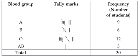
From the above table, we have:
The most common blood group is O.
The rarest blood group is AB.
2
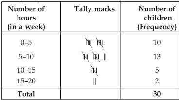
The distance (in km) of 40 engineers from their residence to their place of work were found as follows: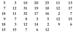
Construct a grouped frequency distribution table with class size 5 for the data given above taking the first interval as 0-5 (5 not included). What main features do you observe from this tabular representation?
Answer
The given distance (in km) are: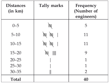
Here, the observation with minimum and maximum value are 2 and 32 respectively.
∵ The first class interval is 0–5,
∴ The classes are:
0–5, 5–10, 10–15, 15–20, 20–25, 25–30, 30–35.
(i) Frequencies of class interval 5–10 and 10–15 are equal, i.e. 11 each. It shows that maximum number of engineers have their residences at 5 to 15 km away from their work place.
(ii) Frequencies of class intervals 25–30 and 25–30 are also equal, i.e. 1 each. It shows that minimum number of engineers have their residences at 20 to 30 km away from their work place.
3
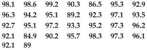
(i) Construct a grouped frequency distribution table with classes 84–86, 86–88, etc.(ii) Which month or season do you think this data is about?
(iii) What is the range of this data?
Answer
Here, the minimum value of the observation = 84.9
The maximum value of the observation = 99.2
∵ Some of the classes are 84–86 and 86–88, etc.
∴ Class size = 86–84 = 2 or 88–86 = 2
So the classes are: 84–86, 86–88, 88–90, 90–92, …, 98–100.
(i) Thus, the required frequency table is: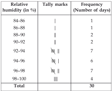
(ii) Since, the relative humidity is high during the rainy season.
∴ The data appears to be taken in the rainy season.
(iii) Since, range = [Highest observation] – [Lowest observation] = 99.2 – 84.9
= 14.3
4
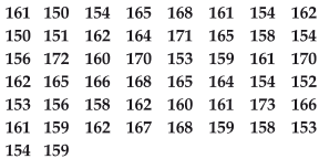
(i) Represent the data given above by a grouped frequency distribution table, taking the class intervals as 160–165, 165–170, etc.
(ii) What can you conclude about their heights from the table?
Answer
(i) Here, the lowest value of the observation = 150The Highest value of the observation = 173
∴ Classes are: 150–155, 155–160, … 170–175.
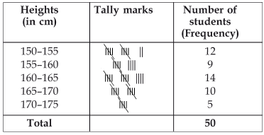
(ii) Conclusions: More than 50% of the students are shorter than 165 cm.
5
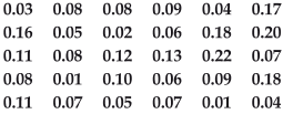
(i) Make a grouped frequency distribution table for this data with class intervals as 0.00–0.04, 0.04–0.08, and so on. (ii) For how many days, was the concentration of sulphur dioxide more than 0.11 parts per million?
Answer
(i) Frequency distribution table for the given data is as follows: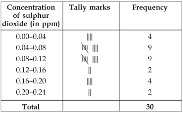
(ii) The concentration of sulphur dioxide more than 0.11 parts was for 8 days.
6
Prepare a frequency distribution table for the data given above.
Answer
The required frequency distribution is as under.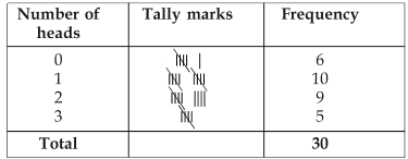
7
3.14159265358979323846264338327950288419716939937510
(i) Make a frequency distribution of the digits from 0 to 9 after the decimal point.
(ii) What are the most and the least frequently occurring digits?
Answer
(i) The value of π upto 50 decimal places is given as below:π = 3.14159265358979323846264338327950288419716939937510
The frequency distribution table of the digits after the decimal point in the value of π is as follows:
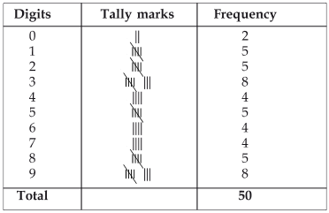
(ii) Maximum frequency is 8.
Hence, 3 is the most frequently occuring digit .
Least frequency is 2.
Hence, o is the least occuring digit.
8
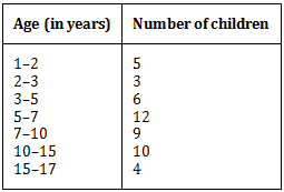
(i) Make a grouped frequency distribution table for this data, taking class width 5 and one of the class intervals as 5–10.
(ii) How many children watched television for 15 or more hours a week?
Answer
Here, the lowest observation = 1The highest observation = 17
∴ The classes are: 0–5, 5–10, 10–15, …, 15–20.
(i) The required frequency distribution is as under.
(ii) Number of children who watched TV for 15 or more hours a week = 2.
9
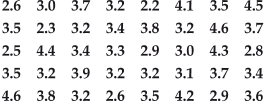
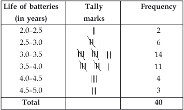
Construct a grouped frequency distribution table for this data, using class intervals of size 0.5 starting from the interval 2–2.5.
Answer
Here, the lowest observation = 2.2 yearsThe highest observation = 4.6 years
The classes are: 2–2.5, 2.5–3.0, 3.0–3.5, …, 4.5–5.0
Thus, required grouped frequency distribution table is as under.
1
A survey conducted by an organisation for the cause of illness and death among the women between the ages 15–44 (in years) worldwide, found the following figures (in %):
| S.No. | Causes | Female fatality rate (%) |
| 1.
2. 3. 4. 5. 6. |
Reproductive health conditions
Neuropsychiatric conditions Injuries Cardiovascular conditions Respiratory conditions Other causes |
31.8
25.4 12.4 4.3 4.1 22.0 |
(i) Represent the information given above graphically.
(ii) Which condition is the major cause of women’s ill health and death worldwide?
(iii) Try to find out, with the help of your teacher, any two factors which play a major role in the cause in (ii) above being the major cause.
Answer
(i) The required graphical representation is given below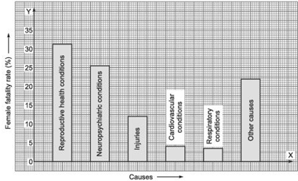
(ii) The major cause of women’s ill health and death worldwide is ‘reproductive health conditions’.
(iii) The two factors are: (a) Deficiency disease (b) Improper diets.
2
The following data on the number of girls (to the nearest ten) per thousand boys in different sections of Indian society is given below.
| Section | Number of girls per thousand boys |
| Scheduled Caste (SC) Scheduled Tribe (ST) Non SC/ST Backward districts Non-backward districts Rural Urban |
940 970 920 950 920 930 910 |
(i) Represent the above information by a bar graph.
(ii) In the classroom discuss what conclusions can be arrived at from the graph.
Answer
(i) The required bar graph is shown in the figure below.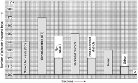
(ii) (a) Number of girls (per thousand boys) are maximum in scheduled tribes whereas (b) minimum in urban.
3
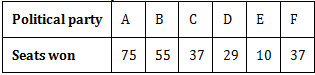
(i) Draw a bar graph to represent the polling results.
(ii) Which political party won the maximum number of seats?
Answer
The required bar graph is given below: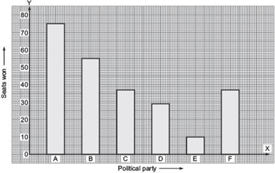
(ii) The political party A won the maximum number of seats.
4
(i) Draw a histogram to represent the given data. [Hint: First make the class intervals continuous]
(ii) Is there any other suitable graphical representation for the same data?
(iii) Is it correct to conclude that the maximum number of leaves are 153 mm long? Why?
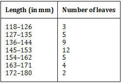
Answer
(i) The given frequency distribution is not continuous.Therefore, first we have to modify it to be continuous distribution.
∴ The modified class intervals are:
(118 – 0.5)–(126 + 0.5) ⇒ 117.5–126.5
(127 – 0.5)–(135 + 0.5) ⇒ 126.5–135.5
(136 – 0.5)–(144 + 0.5) ⇒ 135.5–144.5
(145 – 0.5)–(153 + 0.5) ⇒ 144.5–153.5
(154 – 0.5)–(162 + 0.5) ⇒ 153.5–162.5
(163 – 0.5)–(171 + 0.5) ⇒ 162.5–171.5
(172 – 0.5)–(180 + 0.5) ⇒ 171.5–180.5
Thus, the modified frequency distribution is:
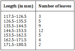
Now, the required histogram of the above frequency distribution is as shown here:
Note: Since, the scale on the x-axis starts at 117.5 (and not at the origin), a break, i.e., a kink , near the origin signify that this graph is drawn with a scale beginning at 117.5, and not at the origin.
(ii) Yes, other suitable graphical representation is a ‘frequency polygon’.
(iii) No, it is not a correct statement.
The maximum number of leaves are not 153 mm long only, rather they are from 145 mm to 153 mm long.
5
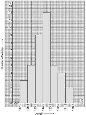
(i) Represent the given information with the help of a histogram.
(ii) How many lamps have a life time of more than 700 hours?
Answer
(i) The required histogram is shown as:
(ii) Number of lamps having life time more than 700 hours = 74 + 62 + 48 = 184.
6
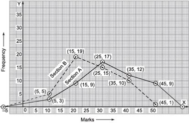
Represent the marks of the students of both the sections on the same graph by two frequency polygons. From the two polygons compare the performance of the two sections.
Answer
To draw a frequency polygon we mark the class marks along x-axis. Therefore, the modified tables are:For section A:
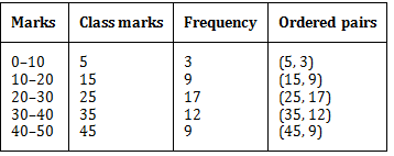
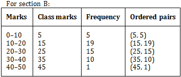
We plot the ordered pairs (5, 3), (15, 9), (25, 17), (35, 12) and (45, 9) and join the points by linesegments and obtain the frequency polygon of section A. Again, to obtain the frequency polygon of section B, we plot the points (5, 5), (15, 19), (25, 15), (35, 10) and (45, 1) on the same coordinate axes and join these points by dotted line-segments.
The two frequency polygons on the same graph are shown below:
7
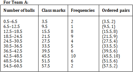
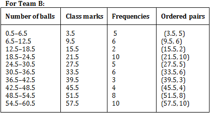
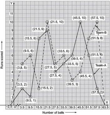
Represent the data of both the teams on the same graph by frequency polygons.
Answer
Note: The given class intervals are not continuous. Therefore, we first modify the distribution as continuous.The modified class intervals along with class marks and ordered pairs of the points to be plotted to draw the required frequency polygon.
Plotting the above ordered pairs on the same graph paper, we get:
8
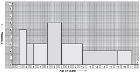
Draw a histogram to represent the above data.
Answer
Here, the class sizes are different therefore, we calculate the adjusted frequencies corresponding to each rectangle.Note: I. In a histogram, the areas of the rectangles are proportional to the corresponding frequencies.
If the widths of all the rectangles are equal, then the lengths of the rectangles are proportional to the frequencies.
II. In case the rectangles have different widths then we need to make modifications in the lengths of the rectangles such that their areas are proportional to the frequencies.
III. We use the following formula:
Here, the minimum class size = 2 – 1 = 1
We have following table of the adjusted frequencies:
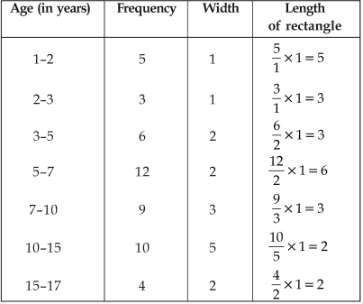
Now, we draw the histogram taking ages (in years) on the x-axis and corresponding adjusted.
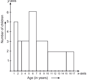
frequencies on the y-axis as shown below:
9
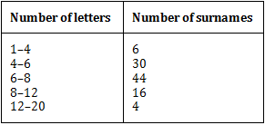
(i) Draw a histogram to depict the given information.
(ii) Write the class interval in which the maximum number of surnames lie.
Answer
(i) Since, class intervals of the given frequency distribution are unequal, and the minimum class-size = 6 – 4 = 2.Therefore, finding the adjusted frequencies we have:
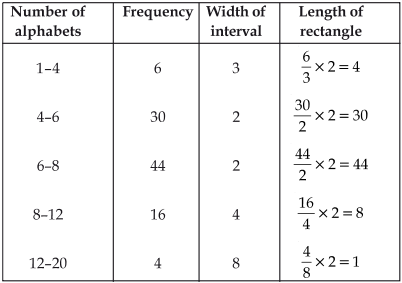
The required histogram is given below:
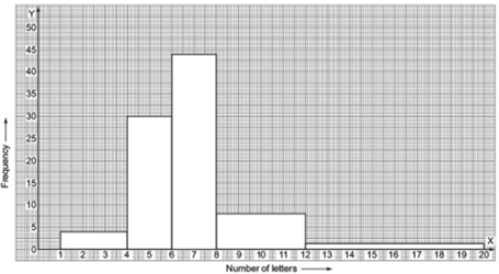
(ii) The maximum frequency is 44, which is corresponding to the class interval 6–8. Maximum surnames lie in the 6–8 class interval.
1
2, 3, 4, 5, 0, 1, 3, 3, 4, 3
Find the mean, median and mode of these scores.
Answer
2
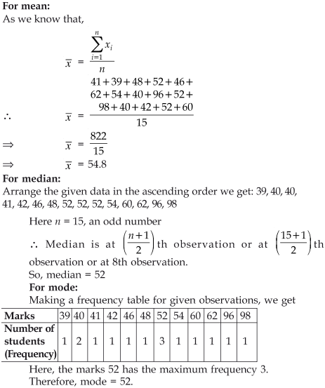
In a Mathematics test given to 15 students, the following marks (out of 100) are recorded:
41, 39, 48, 52, 46, 62, 54, 40, 96, 52, 98, 40, 42, 52, 60
Find the mean, median and mode of this data.
Answer
3
29, 32, 48, 50, x, x+2, 72, 78, 84, 95
Answer
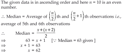
4
(i) 14, 25, 14, 28, 18, 17, 18, 14, 23, 22, 14, 18.
(ii) 7, 9, 12, 13, 7, 12, 15, 7, 12, 7, 25, 18, 7
Answer
(i) we have 14, 25, 14, 28, 18, 17, 18, 14, 23, 22, 14, 18 making a frequency table, we haveHere, the observation 14 has the maximum frequency 4. Therefore, mode = 14
(ii) 7, 9, 12, 13, 7, 12, 15, 7, 12, 7, 25, 18, 7
Making a frequency table, we have
Here, the observation 7 has the maximum frequency 5 . Therefore, mode = 7.
5
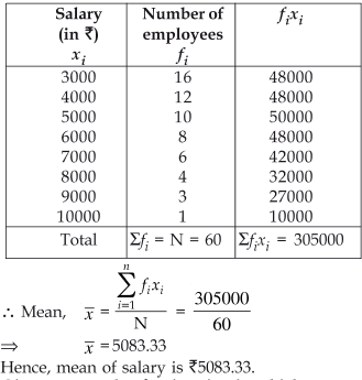
Find the mean salary of 60 workers of factory from the following table:
| Salary in ₹ | Number of workers |
| 3000 | 16 |
| 4000 | 12 |
| 5000 | 10 |
| 6000 | 8 |
| 7000 | 6 |
| 8000 | 4 |
| 9000 | 3 |
| 10000 | 1 |
| Total | 60 |
Answer
6
(i) The mean is an appropriate measure of central tendency.
(ii) The mean is not an appropriate measure of central tendency but the median is an appropriate measure of central tendency
Answer
(i) Mean is a quantitative central tendency of a data.Example: For measuring central tendency of marks of a test we find the mean of the data.
(ii) Median is a qualitative central tendency of a data.
Example: For measuring central tendency of beauty of a group of women, we determine the median of the data.